Graphic Content #20: Alien #4
Welcome back to Graphic Content, Haunted MTL’s #1 comic review series by default. In this installment, we are returning to the world of Marvel’s Alien with issue #4.
Alien #4
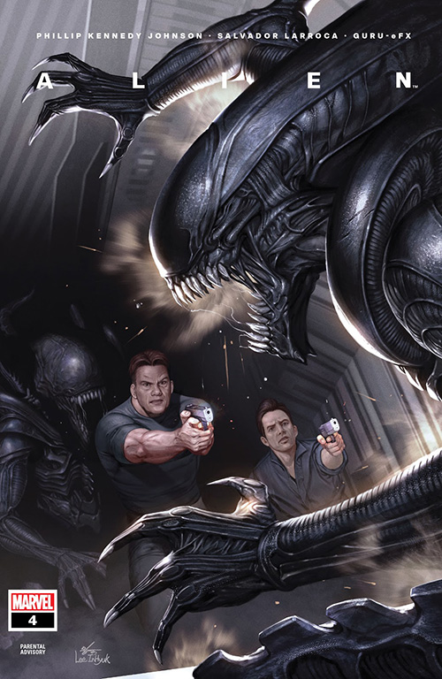
We continue on from the fallout of issue #3 as Gabriel, Bishop, and Hamilton continue the search for Danny across the research facility. When they make a grim discovery, tensions rise as the Xenomorphs seem to have some connection to the embryos they implant in the hosts. The issue drags its feet a bit, covering just enough pages to get to a cliffhanger introducing a new variation on the familiar Xenomorph. That being said, the variation may not be all that new, either.
The pacing of the issue is a problem. Phillip Kennedy Johnson is doing a lot of positioning in this issue and providing bits of backstory without really making much forward momentum. Additionally, Iris’ sudden appearance a few pages in when she doesn’t seem to be present in the group feels weak as well – a bit sudden. Maybe glimpses of her following along would have helped – as it stands, her being on her own and then popping up when she does feels overly convenient. Her survival remains a puzzle, not a compelling puzzle, but a puzzle regardless.
As it stands, I still find it hard to care for any of the characters. Gabriel’s regret isn’t particularly compelling, and the little development outside of being a brooding merc dad doesn’t really give any of his lamentations weight. Bishop ends up being the best character of the bunch so far solely due to the presence of the android in existing films. Even then, while this Bishop spouts Bishopisms, his relationship with Gabriel is superficial at best. Even worst, the comic commits to what is now a trope for the character. It feels like this story is repeating many of the same beats of existing Alien stories but lacking any actual points of interest. Even the revelation of the “new” Xenomorph is ho-hum to anyone who remembers the Praetorian.
I won’t dwell on the art. At this point, Salvador Larroca’s work will not win me over. There is no sense of motion, characters still look strange panel to panel, the inking is a mess, and the coloring in this issue felt particularly off when it came to the “resin” the aliens use to encase hosts. It looks less like sickly greyish-yellow goo and more like blue raspberry candy – I am not sure where Guru-eFX picked up this coloring direction.
Ultimately, I can only hope the series will swap to a different artist on the next arc.

Bottom Line
Alien #4 is a middling, place-setting installment of a series that is failing to live up to the cosmic horror of the Alien franchise’s height. Whatever Phillip Kennedy Johnson is hoping to seed for the franchise needs to impress. At this point, I am not confident it will happen.
 (2 / 5)
Marvel’s Alien #4, written by Phillip Kennedy Johnson, illustrated by Salvador Larroca, and colored by Guru-eFX, is available from Marvel Comics and your local comic shop.
As you’ll see, this time I am not reviewing a second comic. I am going to experiment with a shorter, hopefully, speedier column to increase the number of reviews I can do. We’ll see how that goes.
In the meantime, please let me know what you think of the review. I especially would love to hear from readers of Marvel’s Alien, especially fans of the title. Am I off the mark with my criticism? Let me know in the comments.
Horror in graphic novels
Read Hide if you need a dark graphic novel to talk about over Thanksgiving
Thanksgiving is coming up this week if you live in America. And many of us are going to be in contact with younger relatives. And some of you might be on a mission to be the cool/bad influence relative that introduces them to the horror genre. If so, I have just the graphic novel for you.
Published in September of 2023, Hide is based on the novel of the same name by Kiersten White. It was adapted into a graphic novel by Scott Peterson, and illustrated by Veronica and Andy Fish. It tells the story of fourteen people who believe they are in a reality show, playing Hide and Seek in an abandoned theme park. It should surprise absolutely no one to find out that the creators of the show have something much darker in mind.
The story
Our main character is Mack. She’s had about the worst rough start to life one could imagine and is currently living in a homeless shelter. There, she’s given the opportunity to participate in a game show, playing hide-and-seek.
I like to think that if the shelter manager had known of Mack’s horrific past, she wouldn’t have ever made that suggestion.
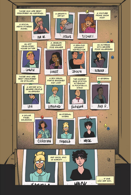
Mack signs up and soon finds herself in an abandoned amusement park with thirteen strangers. The rules are simple. Hide during the day, and be the last person found. Of course, this is nothing but a lie. There will be no winners, only victims.
What works
The first thing we have to talk about is how Hide the graphic novel compares to Hide, the original book. Of course, there wasn’t going to be enough room for every single part of the story. There were some cuts. But it doesn’t feel like anything essential was cut here. The characters remain the same. The storyline is still there, sans any structural issues. Often, this is a difficult thing to do. Some stories don’t translate from one medium to another. But Peterson did a wonderful job.
Of course, we can’t talk about a graphic novel without talking about the art. And the art in this book is fantastic. The colors are rich and vibrant. Everything looks exactly like one might picture it when reading the novel.
Except for the monster, which I have to admit I pictured more like a Rat Creature from Bone.
My favorite part was the journal entries. I loved the cryptic sigils that are scribbled over the page without explanation. I loved the different handwriting. I loved the clippings of newspapers and pictures. The whole thing was just wonderfully, eerily, immersive.
Finally, I want to point out that Hide is a great graphic novel even if you’ve never read the book, and never intend to. This is not a companion for the book. It tells the story all on its own. And yes, reading a graphic novel is just as valid as reading any other novel. This is just a good story, with good artwork. No other reading is necessary.
What didn’t work
There was only one thing I didn’t love about Hide. And that was the ending.
It’s usually the ending.
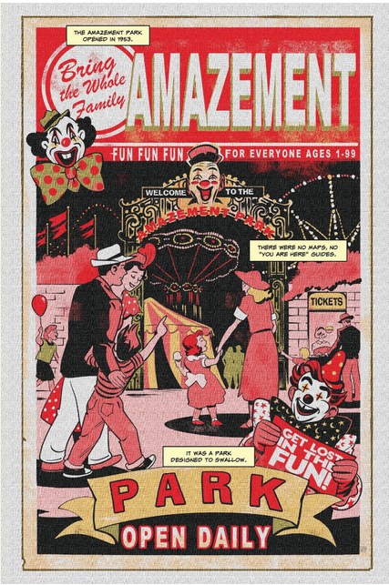
In the novel, the ending is ambiguous but satisfying. This ending was, without ruining it, a little more ambiguous. There are questions I really wanted answers for that I didn’t get. There is at least one character that I’d like to know about. Are they okay? I don’t know. And this ending doesn’t even really give us a hint. All we can do is hope.
If you are going to be picking this up for a younger person, be aware that there is some rough language. There are also a few graphic scenes of violence, so if that’s the sort of thing that will get you banned from further holiday events, be aware. But if you have a tween or teen who needs to be encouraged to delve into the creepy side, Hide is a great way to do it. Of course, there’s no shame in just reading it yourself.
 (4.5 / 5)
Book Reviews
Vermis II: Mist & Mirrors, a Book Review
Vermis II: Mist & Mirrors is a graphic novel by Plastiboo, acting as the “official guide for a game that doesn’t exist.”
Vermis II: Mist & Mirrors is a graphic novel by Plastiboo. The team behind the work includes Plastiboo as the artist, Hollow Press as the publisher, Michele Nitri as the editor, Christian Dolz Bayarri as the graphic designer, Marco Cirillo Pedri as the graphic supervisor, and E.R. as the English editor and proofreader. The Vermis collection seems sold out in its current editions, but I still recommend ordering from the original publisher, Hollow Press.
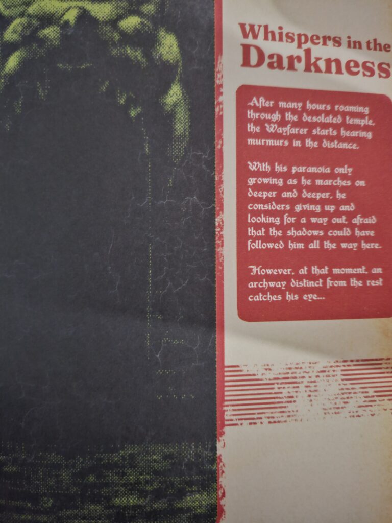
Who stares back from the dark glass? The Wayfarer travels–cursed and haunted by their past–through the distant lands and places within the Mist & Mirrors. Endure a corrupt world and struggle to fend off the curses that mark you. Venture forth, Wayfarer, and perhaps find peace and salvation.
What I Like about Vermis II: Mist & Mirrors
The premise remains an “official guide” to a game that does not exist. However, one key distinction that stands out is the corrosion of this “official guide” mark, suggesting Mist & Mirrors centers itself as a graphic novel. In this sense, it more accurately hits its vision while providing an engaging story.
Mist & Mirrors places its character selection at the end of the graphic novel, instead, choosing a character and allowing the reader to follow that journey. While this moves away from the “official guide” concept, it better fleshes out the world and creates a more independent product.
Where Vermis I held a heavy retro-game aesthetic, Vermis II takes this to the next level while adding a wider range of color than the original. Not only does this add more aesthetic variety, but it also vastly improves readability. My greatest critique of the first graphic novel was the general lack of readability that impacted the experience, but Mist & Mirrors seems to take this to heart. Beyond the variety and improvement, the design changes the color themes to match the distinct lands the “Wayfarer” embarks on, giving a direct purpose to the changes.
On starting the graphic novel, I half expected a spiritual successor set in a new world. While its setting certainly differs from the original, Mist & Mirrors expands on the lore and history. In fact, the exploration of Mist & Mirrors adds value to the original and encourages a re-read. Honestly, that’s what all sequels strive (or should strive) to succeed.
Despite the colorful innovation, Vermis II: Mist & Mirrors delivers that same bleak horror popularized by Dark Souls. It still wears its inspirations on its sleeves while better communicating its “game mechanics.”

Tired Tropes and Triggers
Again, there aren’t many points worth mentioning regarding tropes or triggers. As the graphic novel takes themes and trends from the Soulslike genre, it’s dark and bleak but not overwhelmingly so.
Payment and delivery (for American audiences) still come with a 15 to 45-day wait period with little room for verification or updates. The process through PayPal remains seamless, and I received the novel within the timeframe, but it’s a consideration.

What I Dislike about Vermis II: Mist & Mirrors
While there are notable points to mention in this section, Mist & Mirror vastly mitigates Vermis I’s core issues. However, that isn’t inherently the same as fixing them in some cases. For example, readability remains a slight issue. I will emphasize it as a slight issue with the vast improvements implemented.
For those fans of the specific niche that Vermis aims to deliver, Mist & Mirrors tones down the “official guide” aspect. Instead, it favors a more straightforward narrative that follows a specific character. This brings life to the “game world” and makes an independent product but limits Vermis I’s game guide concept.
On a more personal note, I did enjoy the concept of Vermis I’s classes over the classes of Mist & Mirrors. Naturally, there are some interesting concepts, but nothing haunts me like the Infant Seeker or Rat Man. However, the new choices seem to provide a stronger narrative and backstory.

Final Thoughts
Vermis II: Mist & Mirrors vastly improves in many aspects of the original, telling a story set in its bleak and fascinating world. While it does veer from the original concept, it does so to make a more independent product. If you are looking to lose yourself in a strange world or dive deeper into Vermis’ underexplored lore, Mist & Mirrors seems tailor-made for you.
Horror in graphic novels
Bad Dreams in the Night
Published in April of this year, Bad Dreams in The Night is a collection of horror comics by the artist and author Adam Ellis. With the description stating that it is a graphic novel version of Scary Stories to Tell in the Dark, I had to get my hands on it. And it did not disappoint.
The stories
Bad Dreams in the Night consists of eleven short horror stories. I honestly don’t think there’s a bad one in the whole bunch. So let’s just highlight a few.
Easily my favorite story in the book was Little House in the Sea. It’s a sweet, eerie little tale that seems like a pinprick view into a dark and horrifying world. It left me with so many questions that I fear will never have answers. The story is about a young woman and her mother, who live on a little island all alone. The young woman is never to ask about what is on the other side of the sea. Then, her mother dies. And everything changes, but not by a lot.
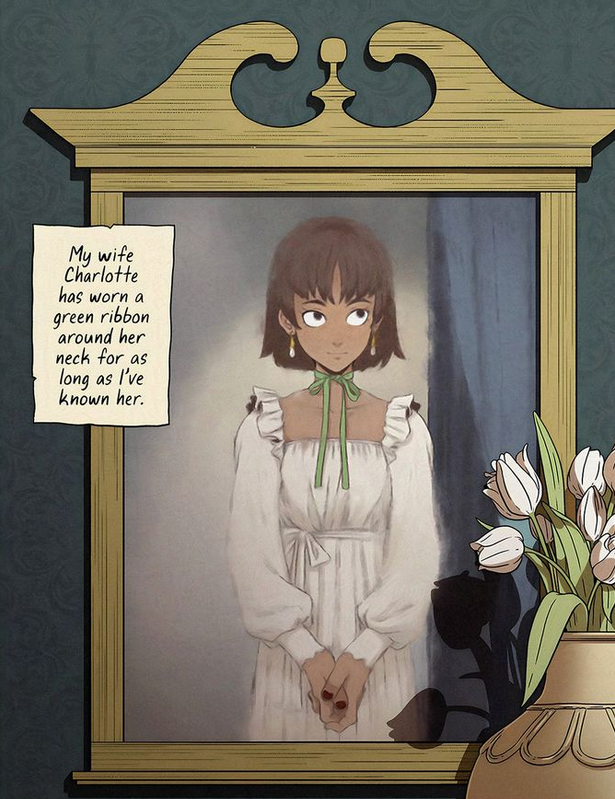
Green Ribbon was another great story. It’s a retelling of the classic Girl With a Ribbon story from the original Scary Stories book, in which a man is confused and eventually angry that the love of his life wears a ribbon around her neck and won’t tell him why. I liked this updated version. It’s a stark reminder that just because we marry someone, we aren’t owed all of their secrets.
What worked
Of course, the first thing I have to point out about Bad Dreams in the Night is the fantastic artwork. Ellis was a cartoonist first, and it shows.
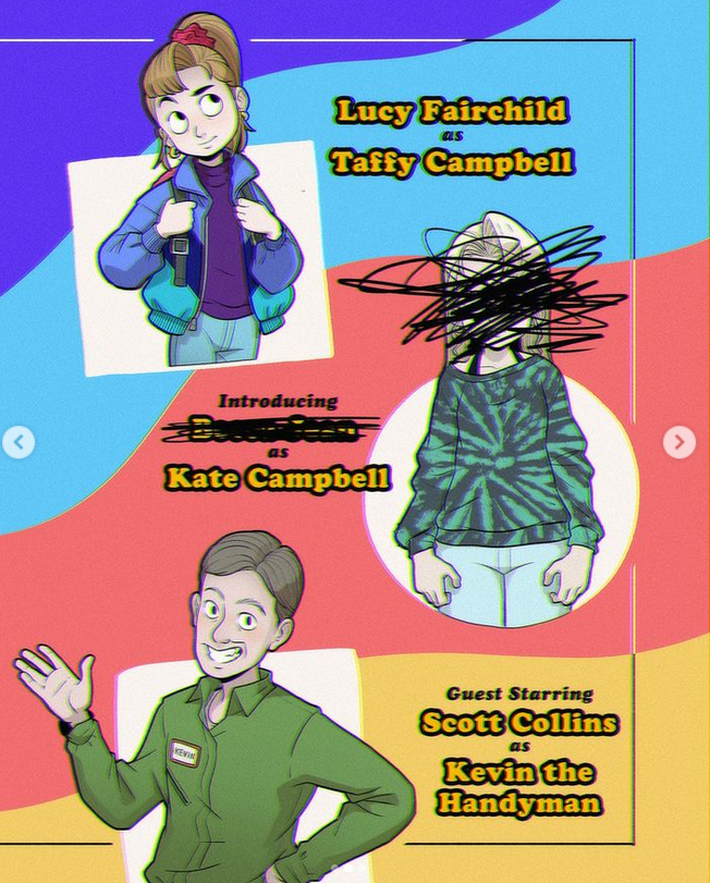
The artwork is part of the storytelling as well. The best example of this is the story Better Kate Than Never. The younger sister character, Taffy, has such an animated face during the scenes with a ‘studio audience’. When she is just herself, her face is flat, and far more mature than we’d expect for a girl her age.
Though, I suppose based on the story, she might be any age.
Another really enjoyable thing was the mini-essays at the end of each story. As a creator myself, I love the little peeks into the creative process. I know how I come up with stories. But it’s different for everyone, and the story behind the story is often just as fun.
Finally, I have to praise a feature that applies to Ellis’s work overall, not just this book. Whenever he writes scary stories (and he has posted quite a few on his social media) they are a fascinating blend of cute and horrifying. The artwork always has a lovely, innocent, cartoonish look. The children always look like cartoon children, with exaggerated large heads and wide circular eyes.
At the same time, Ellis doesn’t pull any punches when it comes to the blood and gore. One story in particular, Milk Door, is a perfect example of this. I don’t want to spoil the ending for you, but it is graphic, horrifying, and wonderful.
What (kind of) didn’t work
I only have one issue with this book. If you follow Ellis on social media, you’ve likely seen at least some of these stories before.
Though, even as I say this, I’m not sure what could have been done about it. Only the beginnings were shown on Instagram. This was a marketing tactic and an effective one. You get the setup for free, but you have to read the book for the punchline.
Bad Dreams in the Night was a really enjoyable way to spend a few hours. In the end, my only real complaint is that it could have been longer. But of course, that is one of the chief rules of entertainment. Always leave people wanting more.
(usr 5)
By the way, if you like this you might enjoy my haunted apartment novella, Quiet Apocalypse. The main character is a modern witch, and I share some real magic in this fictional story of an unexpected end of the world.

