Graphic Content #1
Well, it took a bit, but I am back to reviewing comics here at Haunted MTL. I am wanting to tackle a few titles, but my previous style of long reviews, while fun, isn’t super conducive to that.
So, welcome to Haunted MTL’s Graphic Content. Here I will review two or three titles in one go. The aim is to post a couple of comic review updates a month. On that note, I am always on the lookout for new titles, so please drop a title you want to see me cover in the comments.
So, let’s dive in. This week we are covering the continuing adventures of John Constantine and taking another trip to Killadelphia.
John Constantine: Hellblazer #3
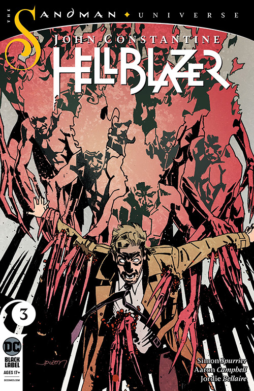
Where we last left John Constantine he was dealing with invisible angels. This time around he confronts Tulpa magic and faces complications in the form of the street gang he is working for on behalf of his new assistant, Noah.
Spurrier’s writing and plotting still very much evokes some of that 1990s Hellblazer goodness. I am still very much entranced by the London being shown in this title, though the slang can, at times, feel a bit overwhelming. It takes me a little more time than I’d like to parse out some of the sayings, but I am glad to say three issues in that that is definitely less of an occurrence. I do worry the comic might be tapping that well too deeply, however. Regardless, the surrounding cast including Nat and the phone-bound demon Vestibulan are adding a lot of texture to the story.
The art continues to impress as well. One particularly poignant moment of loss, fallout from the cross-universe shenanigans of Constantine’s past is rendered with the requisite amount of heartbreak. Hellblazer’s London is still suitably grimy and there are some particularly fun shots present. A bit featuring British Sign Language takes full advantage of the displaced timing present in comic framing.
Ultimately, this storyline seems to conclude with the simple act of John leveraging his different sources and using words to solve the crisis at hand. It is all very on brand.
 (4 / 5)
John Constantine: Hellblazer #3 – “A Green and Pleasant Land, Part Three” was written by Simon Spurrier, illustrated by Aaron Campbell, and colored by Jordie Bellaire.
Killadelphia #4
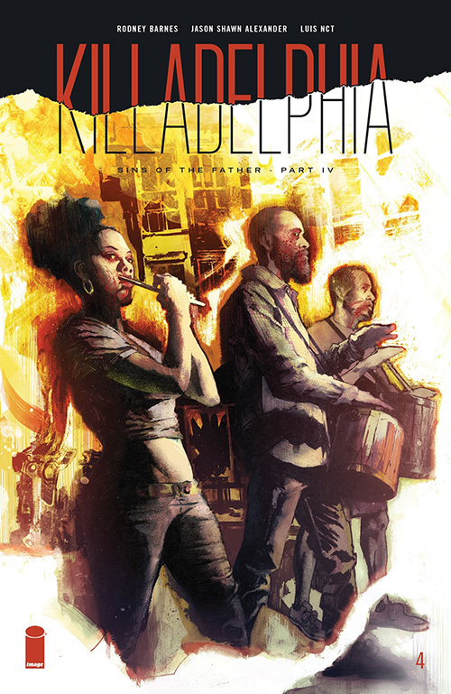
When we last left off with Killadelphia we learned a lot about the secret vampiric history of the United States in a very satisfying third issue. This week we continue the “Sins of the Father” story arc with the fourth part, “… Cry Out for Revolution.” Killadelphia has had three strong issues out the gate, but can that continue into the fourth issue?
Killadelphia’s fourth issue begins with the crisis of Philadelphia’s secret vampire population engaged in large scale attacks against the population. These scenes of carnage are rendered beautifully. Barring some unusual discrepancies in how characters appear from panel to panel, the overall issue is visually stunning.
The characters continue to prove compelling. The modern, vampiric take on John and Abigail Adams, in particular, are striking antagonists. Yet I am less sold on another key pairing. It takes a romantic turn and for me, it seems a bit fast. Despite that, I have found most of the story to progress appropriately even with the added impetus of the vampiric attacks.
The fact I am getting to this issue as late as I am, given the current unrest and protests against law enforcement around the US carries extra resonance here. The fact that the primary protagonists represent two generations of law enforcement and the vampiric population is largely comprised of people of color definitely provokes something uneasy. Particularly when the reluctant vampire, Tevin, talks to Sangster Sr., asking of the now-vampiric detective “How do Police see people like me?” Sangster Sr.’s response is disheartening and unsurprising: “As the enemy.” And no, he just doesn’t mean in the undead sense, here.
I think Killadelphia is an important horror comic right now. That is not to say that it wasn’t already important, but Barnes and his team have done a great job dealing with very tough topics. Keep them coming.
 (4.5 / 5)
Killadelphia #3 – “…Cry Out for Revolution” was written by Rodney Barnes, illustrated by Jason Shawn Alexander, and colored by Luis Nct.
See you soon for another installment of Graphic Content here at Haunted MTL.


Book Reviews
Vermis II: Mist & Mirrors, a Book Review
Vermis II: Mist & Mirrors is a graphic novel by Plastiboo, acting as the “official guide for a game that doesn’t exist.”
Vermis II: Mist & Mirrors is a graphic novel by Plastiboo. The team behind the work includes Plastiboo as the artist, Hollow Press as the publisher, Michele Nitri as the editor, Christian Dolz Bayarri as the graphic designer, Marco Cirillo Pedri as the graphic supervisor, and E.R. as the English editor and proofreader. The Vermis collection seems sold out in its current editions, but I still recommend ordering from the original publisher, Hollow Press.
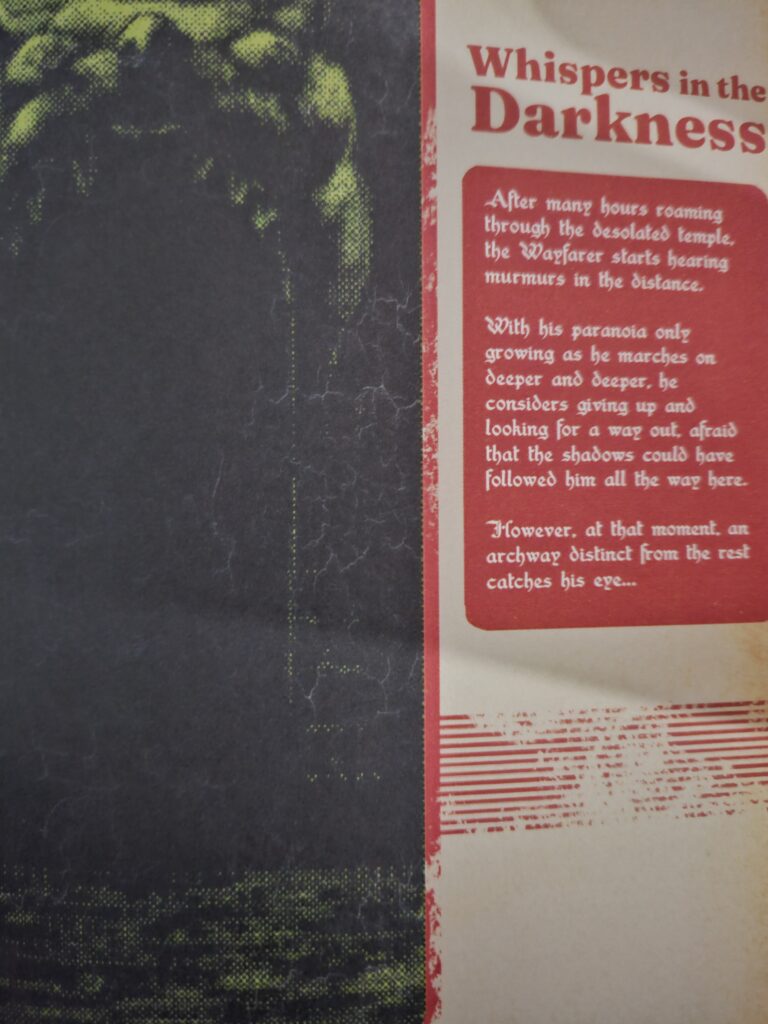
Who stares back from the dark glass? The Wayfarer travels–cursed and haunted by their past–through the distant lands and places within the Mist & Mirrors. Endure a corrupt world and struggle to fend off the curses that mark you. Venture forth, Wayfarer, and perhaps find peace and salvation.
What I Like about Vermis II: Mist & Mirrors
The premise remains an “official guide” to a game that does not exist. However, one key distinction that stands out is the corrosion of this “official guide” mark, suggesting Mist & Mirrors centers itself as a graphic novel. In this sense, it more accurately hits its vision while providing an engaging story.
Mist & Mirrors places its character selection at the end of the graphic novel, instead, choosing a character and allowing the reader to follow that journey. While this moves away from the “official guide” concept, it better fleshes out the world and creates a more independent product.
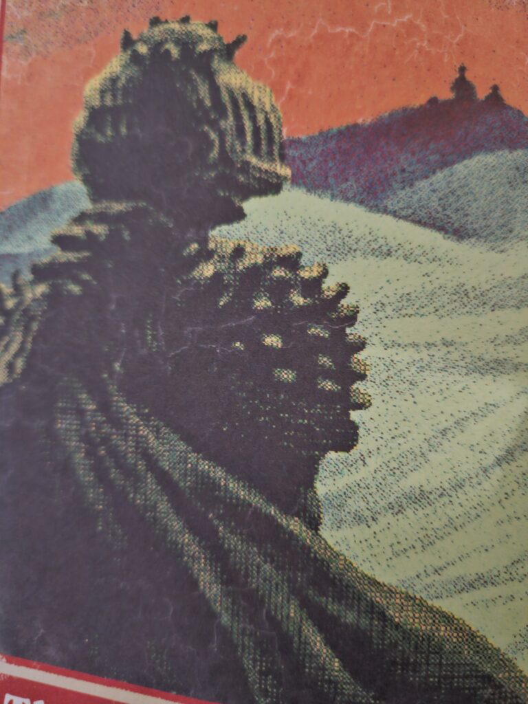
Where Vermis I held a heavy retro-game aesthetic, Vermis II takes this to the next level while adding a wider range of color than the original. Not only does this add more aesthetic variety, but it also vastly improves readability. My greatest critique of the first graphic novel was the general lack of readability that impacted the experience, but Mist & Mirrors seems to take this to heart. Beyond the variety and improvement, the design changes the color themes to match the distinct lands the “Wayfarer” embarks on, giving a direct purpose to the changes.
On starting the graphic novel, I half expected a spiritual successor set in a new world. While its setting certainly differs from the original, Mist & Mirrors expands on the lore and history. In fact, the exploration of Mist & Mirrors adds value to the original and encourages a re-read. Honestly, that’s what all sequels strive (or should strive) to succeed.
Despite the colorful innovation, Vermis II: Mist & Mirrors delivers that same bleak horror popularized by Dark Souls. It still wears its inspirations on its sleeves while better communicating its “game mechanics.”

Tired Tropes and Triggers
Again, there aren’t many points worth mentioning regarding tropes or triggers. As the graphic novel takes themes and trends from the Soulslike genre, it’s dark and bleak but not overwhelmingly so.
Payment and delivery (for American audiences) still come with a 15 to 45-day wait period with little room for verification or updates. The process through PayPal remains seamless, and I received the novel within the timeframe, but it’s a consideration.
What I Dislike about Vermis II: Mist & Mirrors
While there are notable points to mention in this section, Mist & Mirror vastly mitigates Vermis I’s core issues. However, that isn’t inherently the same as fixing them in some cases. For example, readability remains a slight issue. I will emphasize it as a slight issue with the vast improvements implemented.
For those fans of the specific niche that Vermis aims to deliver, Mist & Mirrors tones down the “official guide” aspect. Instead, it favors a more straightforward narrative that follows a specific character. This brings life to the “game world” and makes an independent product but limits Vermis I’s game guide concept.
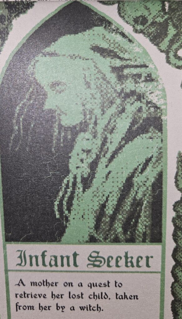
On a more personal note, I did enjoy the concept of Vermis I’s classes over the classes of Mist & Mirrors. Naturally, there are some interesting concepts, but nothing haunts me like the Infant Seeker or Rat Man. However, the new choices seem to provide a stronger narrative and backstory.
Final Thoughts
Vermis II: Mist & Mirrors vastly improves in many aspects of the original, telling a story set in its bleak and fascinating world. While it does veer from the original concept, it does so to make a more independent product. If you are looking to lose yourself in a strange world or dive deeper into Vermis’ underexplored lore, Mist & Mirrors seems tailor-made for you. (5 / 5)
Published in April of this year, Bad Dreams in The Night is a collection of horror comics by the artist and author Adam Ellis. With the description stating that it is a graphic novel version of Scary Stories to Tell in the Dark, I had to get my hands on it. And it did not disappoint.
The stories
Bad Dreams in the Night consists of eleven short horror stories. I honestly don’t think there’s a bad one in the whole bunch. So let’s just highlight a few.
Easily my favorite story in the book was Little House in the Sea. It’s a sweet, eerie little tale that seems like a pinprick view into a dark and horrifying world. It left me with so many questions that I fear will never have answers. The story is about a young woman and her mother, who live on a little island all alone. The young woman is never to ask about what is on the other side of the sea. Then, her mother dies. And everything changes, but not by a lot.
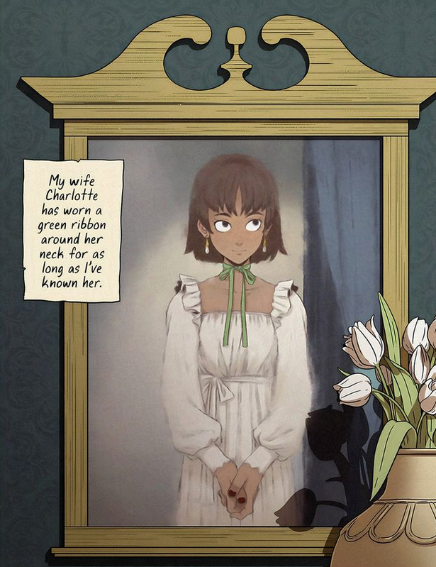
Green Ribbon was another great story. It’s a retelling of the classic Girl With a Ribbon story from the original Scary Stories book, in which a man is confused and eventually angry that the love of his life wears a ribbon around her neck and won’t tell him why. I liked this updated version. It’s a stark reminder that just because we marry someone, we aren’t owed all of their secrets.
What worked
Of course, the first thing I have to point out about Bad Dreams in the Night is the fantastic artwork. Ellis was a cartoonist first, and it shows.
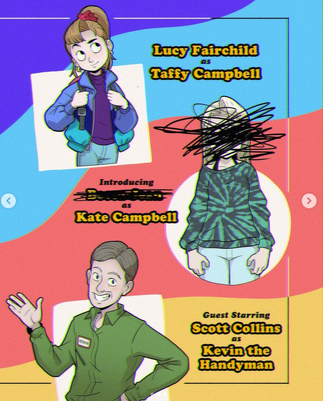
The artwork is part of the storytelling as well. The best example of this is the story Better Kate Than Never. The younger sister character, Taffy, has such an animated face during the scenes with a ‘studio audience’. When she is just herself, her face is flat, and far more mature than we’d expect for a girl her age.
Though, I suppose based on the story, she might be any age.
Another really enjoyable thing was the mini-essays at the end of each story. As a creator myself, I love the little peeks into the creative process. I know how I come up with stories. But it’s different for everyone, and the story behind the story is often just as fun.
Finally, I have to praise a feature that applies to Ellis’s work overall, not just this book. Whenever he writes scary stories (and he has posted quite a few on his social media) they are a fascinating blend of cute and horrifying. The artwork always has a lovely, innocent, cartoonish look. The children always look like cartoon children, with exaggerated large heads and wide circular eyes.
At the same time, Ellis doesn’t pull any punches when it comes to the blood and gore. One story in particular, Milk Door, is a perfect example of this. I don’t want to spoil the ending for you, but it is graphic, horrifying, and wonderful.
What (kind of) didn’t work
I only have one issue with this book. If you follow Ellis on social media, you’ve likely seen at least some of these stories before.
Though, even as I say this, I’m not sure what could have been done about it. Only the beginnings were shown on Instagram. This was a marketing tactic and an effective one. You get the setup for free, but you have to read the book for the punchline.
Bad Dreams in the Night was a really enjoyable way to spend a few hours. In the end, my only real complaint is that it could have been longer. But of course, that is one of the chief rules of entertainment. Always leave people wanting more.
(usr 5)
By the way, if you like this you might enjoy my haunted apartment novella, Quiet Apocalypse. The main character is a modern witch, and I share some real magic in this fictional story of an unexpected end of the world.
Vermis I: Lost Dungeons and Forbidden Woods is a graphic novel by Plastiboo. The team behind the work includes Plastiboo as the artist, Hollow Press as the publisher, Michele Nitri as the editor, Marco Cirillo Pedri as the graphic designer, and a mysterious E.R. as the English proofreader. While I found the book available across outlets, I would recommend going directly to Hollow Press as I am unsure of the reliability of these other options.
Which flesh is your flesh? Come traveler and pick between several distinct classes to explore the bleak world of Vermis. Catastrophe and calamity dictate the lands you travel to, warring to break all living here. Venture forth, but be forewarned, hope remains a distant memory.
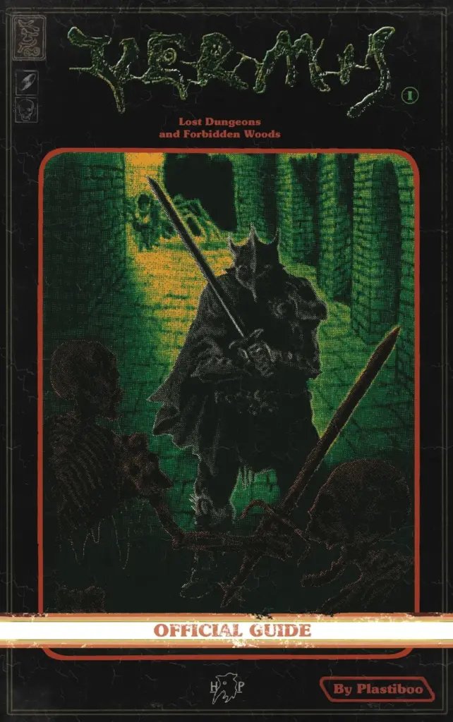
What I Love About Vermis I
The premise of this book was that of “an official guide of a game that doesn’t exist.” I was reminded of countless nights studying such books for every drop of lore I could. It paid passionate respect to these guides, bringing to life a retro game inspired by Dark Souls but entirely its own. The concept creates an interesting and interactive fiction, requiring readers to build an understanding of mechanics and gameplay that doesn’t actually exist.
The art style evoked a green-saturated pixel-apocalypse in a fantasy setting. This premise likely evoked your interest or turned you away. Vermis I committed to this style, so that desire remained an important part of your enjoyment.
When I learned of the Infant Seeker class, I had to admit a curiosity. The “classes” are unique, painting a perspective and “playstyle” that fleshes out this imagined world. To be clear, this isn’t a “choose your own adventure” experience. The book is informative, with some options sprinkled in. However, these options are purposefully limited, revealing little for possible interpretations.
While Vermis I was not a large graphic novel, I couldn’t put it down. On the first day I held it in my hands, I finished it. There were sections and natural break points to help pace the material, but it kept me engaged throughout.
Vermis I evoked a bleak horror all too familiar to those of the Dark Souls fandom. While I couldn’t call this a Soulslike, as it doesn’t provide any mechanics associated with the genre, Vermis I follows the story trends and themes closely.
Tired Tropes and Considerations
Aside from the bleak world, there’s little to discuss in triggers and tropes. It’s worth mentioning that infants were considered a delicacy to witches in this world, but that’s not given much time or focus.
The biggest consideration was the purchasing process. It was largely seamless through PayPal, but American audiences would need some third party to convert payment. Wait time lingered between 15 to 45 days with no notifications to alleviate worries. I didn’t blame this experience on Hollow Press, but it was certainly a drawback.
For transparency, my purchase arrived ahead of the latest mark, ranging within 20 days. There was also an additional purchase option for a price increase that might have resulted in notifications.
What I Dislike About Vermis I
Readability remained my only major concern and issue throughout the text. This issue stemmed from creative decisions and art style choices that make reading certain sections difficult. The retro art also left some room for misinterpretation. Vermis I’s title represented this issue perfectly. Yes, it’s artistic and haunting but challenging to read.
Vermis I appealed to a rather specific niche. It had room to further develop this informative aspect but reached its intended goal in an arena of limited competition. In fact, the specifics made Vermis I the only such contestant in its arena. Outside this niche, there’s retro gaming art and a heavy influence of Dark Souls to appeal further. Regardless, it’s a specific experience that either sounds interesting or unappealing.
Though enjoyable, this wasn’t a perfect parallel to reading those official guides. Vermis I provided a more obtuse experience compared to other such books. However, this might better represent the Dark Souls influence. Vermis I’s “game” would be a linear experience with replay value. It’s a funny way of looking at the content, but that’s the premise one buys into.
As unique as this graphic novel turned out to be, and how enjoyable the content remained, Vermis I left much room to further explore a dynamic it partly founded. I do hope Vermis II expanded on the material as either a companion piece or an original setting.
Final Thoughts
Vermis I: Lost Dungeons and Forbidden Woods delivered a unique graphic novel experience. Part guidebook and adventure novel with sprinkles of Dark Souls influence, this graphic novel provided an enjoyable and haunting world that evoked the imagination. While it felt condensed for a sole project, it catered to a focused niche while creating a market. (3.5 / 5)